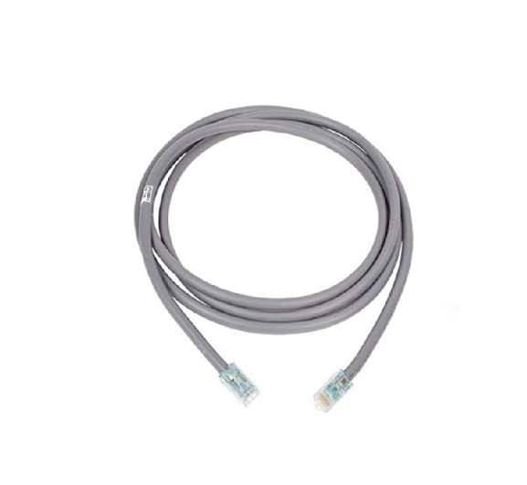
 Systimax, UTP Patch Cord, 10m. Systimax, Copper x10D, CAT6A Cable.
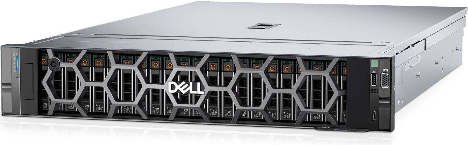 PowerEdge R760xs, 3.5" Chassis with up to 12 Hard Drives (SAS/SATA), Xeon 4514Y, 2GHz. Cache Memory: 30MB.…
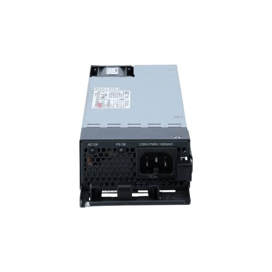 Cisco Catalyst 9800-40 Power Supply, 750W AC/Reverse Air/Hot-swappable.
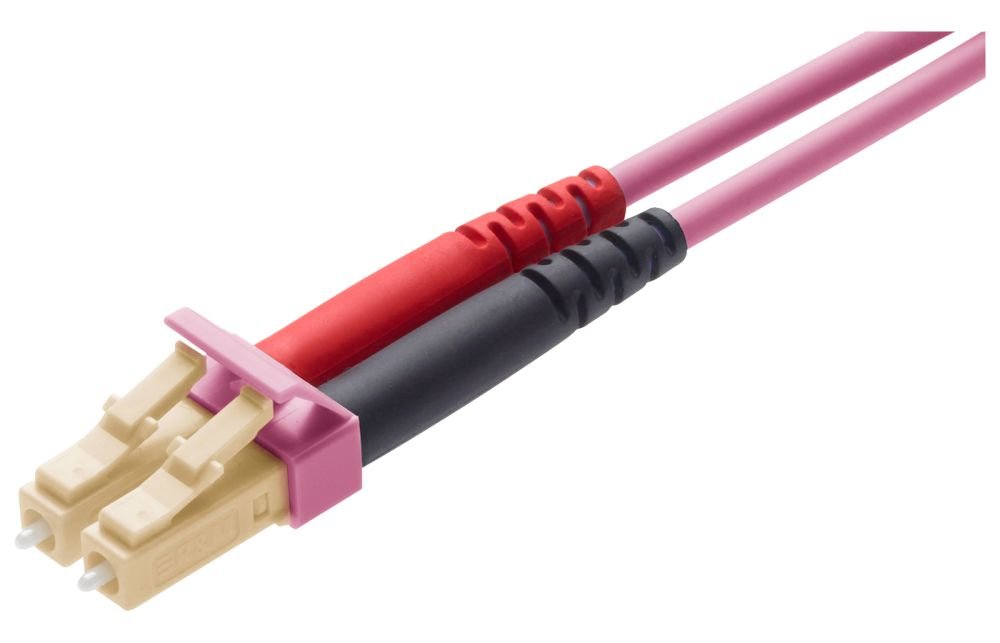 Patch Cord LC-Duplex PC - LC-Duplex PC beige/heather violet OM4 Bm/3 F8 2.0x4.1mm 5 m
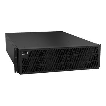 Smart-UPS RT 192V 32*5Ah BP, without ralikit.
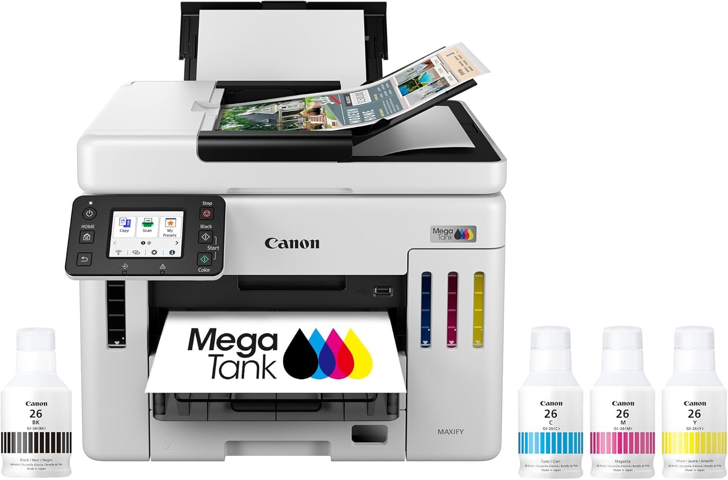 Canon GX7120 Wired & Wireless MegaTank Inkjet Multifunction Printer - Color. Designed to meet the needs of…
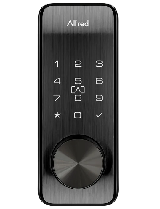 Smart lock now comes with a built in RFID card reader and can hold up to 250 unique cards (Includes 2 RFID…
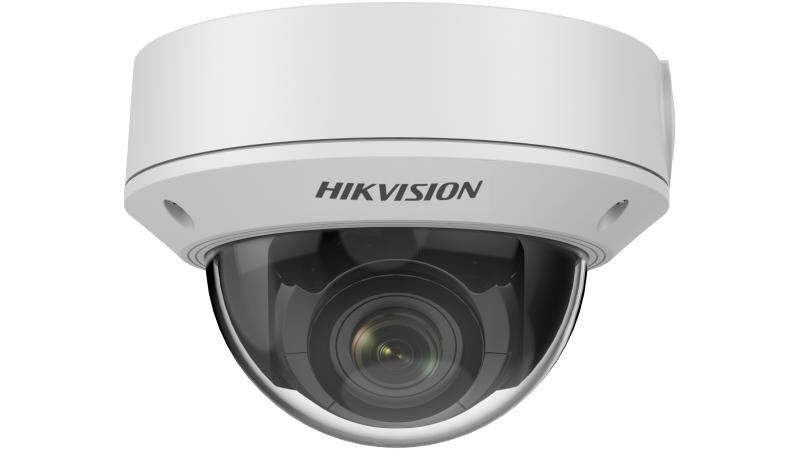 5 MP IR Varifocal Network Dome Camera, 2560 × 1920 @15fps Color: 0.01 Lux @ (F1.2; AGC ON), 0.02 Lux…


















































What we install
Structured Cabling & Networks
Cat6/Cat6A and fiber cabling, racks, switches, routers and firewalls, tested and certified.
Data Center Builds
Full-solution server rooms and data centers: servers, storage, UPS, power and cooling.
CCTV & Video Surveillance
IP camera systems with NVR recording and remote mobile viewing for buildings, warehouses and homes.
IPTV, SMATV & MATV
TV distribution over IP, coaxial or fiber for hotels, hospitals, compounds and buildings.
Access Control & Intercom
Card, fingerprint and face access control, door locks, time attendance and video intercom.
Wi-Fi Solutions
Enterprise wireless design and installation with full coverage for offices, hotels and villas.
IP Telephony
IP PBX and VoIP phone systems connecting every office, extension and branch.
Smart Home & Audio-Video
Control of lighting, climate, curtains, audio and video, plus theater and meeting-room AV.
Low current systems contractor in Riyadh, since 1999
DSIT — Digital Supply for IT — designs, supplies and installs the low current (ELV) systems modern buildings depend on. One team takes every project from site survey and design to installation, testing, commissioning and after-sales support, for government buildings, hospitals, universities, hotels, banks, palaces and private villas across Saudi Arabia.